

Green Shield Canada
Website Design & Brand Refresh
Affordable Group Health Coverage
Client:
Agency:
Roles:
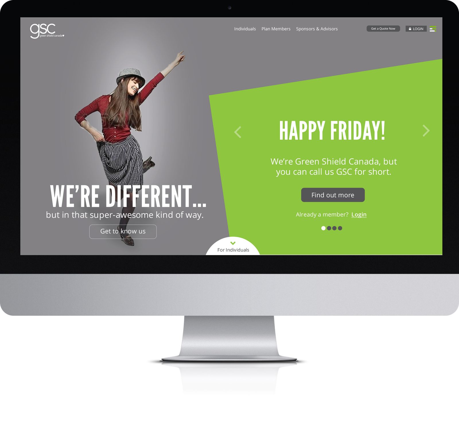
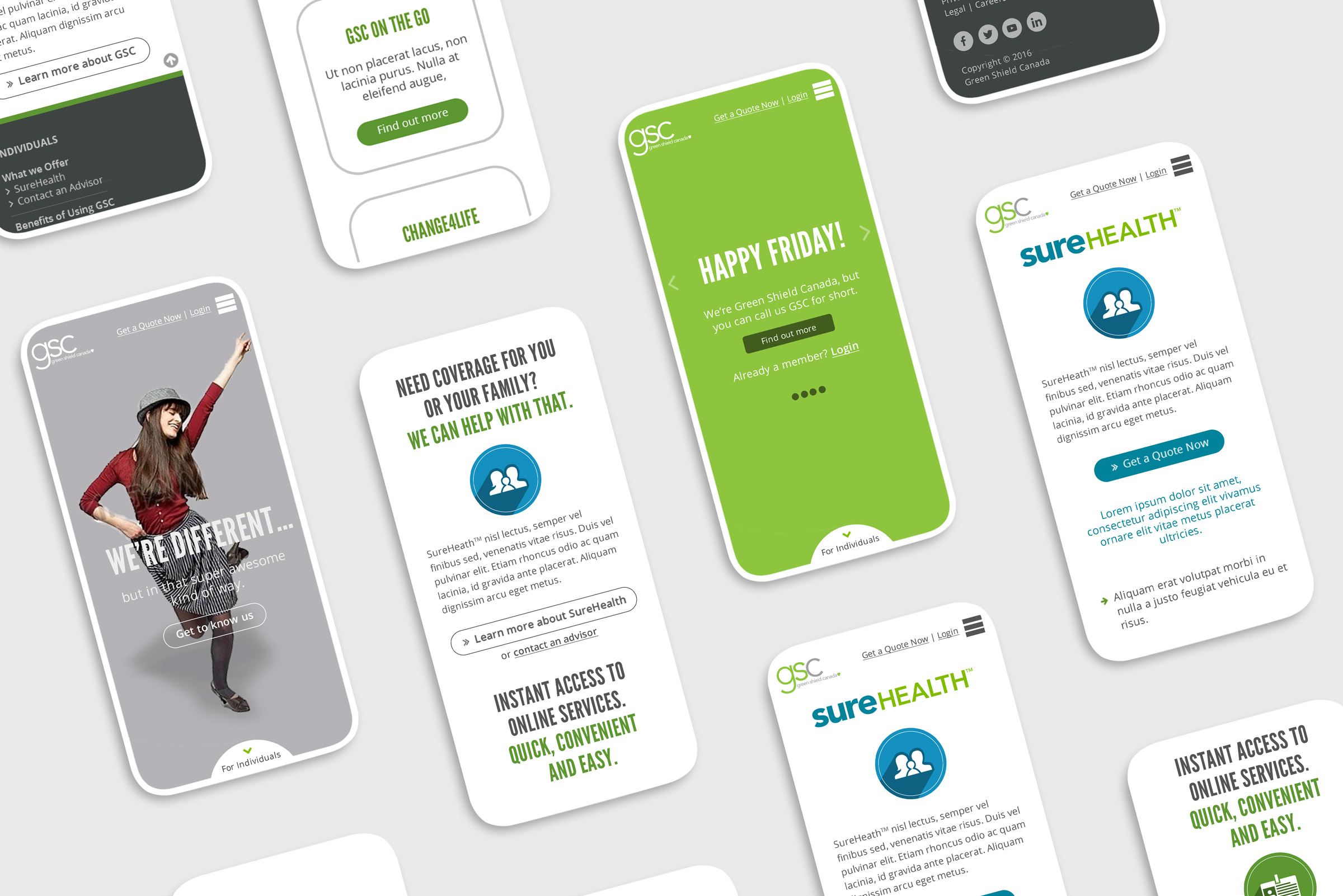
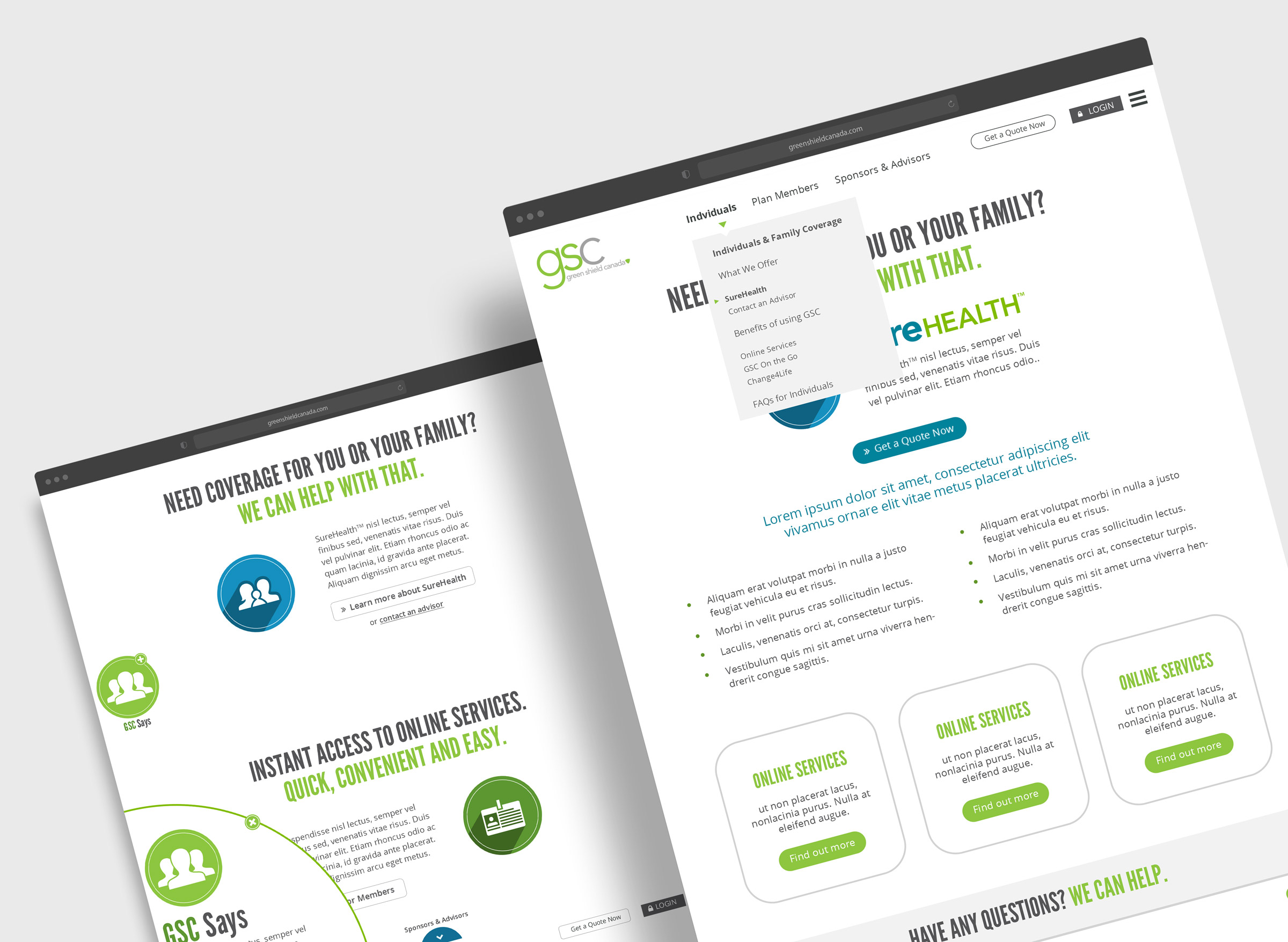
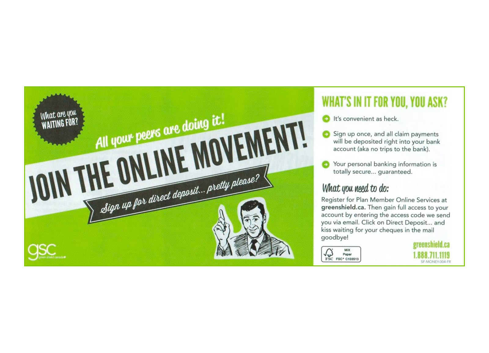
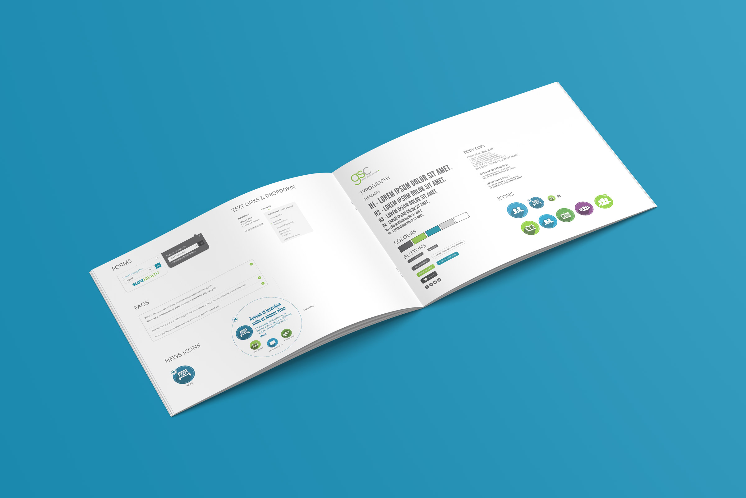
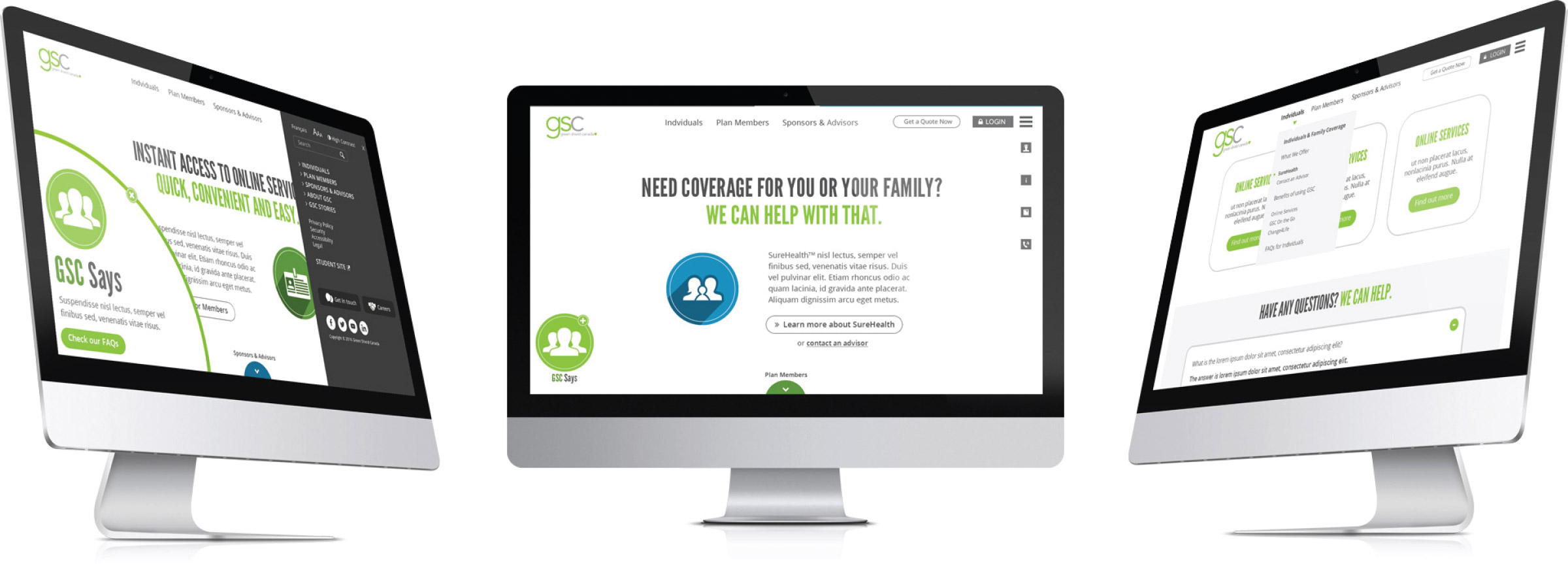
GSC was in need of a new look and feel for their website, but not ready to rebrand. Keeping their existing logo and primary colour, we developed a website and style guide that modernized their collateral, which had been a fun but out of date vernacular aesthetic. Using a new set of icons, expanded colour palette and digital-specific addendum to their brand, we developed a look and feel that kept them looking fresh and relevant, while maintaining their warm and inviting approach.
(Right/Below: Home Screen)
A Mini Rebrand
While a brand refresh doesn't have all the rigour of a full-on rebrand, there is the added challenge of maintaining a stronger consistency with existing brand elements, while also doing one's best to consider future needs and where the brand might go. Ideally users should scarcely notice.
(Left/above: original look & feel)
Let's work together
ABOUT ME

If I had to say what is best about my approach, it would be the curiosity that drives me to do new things and the tenacity to make things I know how to do better. This has led me into many other aspects of creative, such as strategy, motion, illustration, front end development, key art & music underscore composition.
As a result, I work very well with people from other related disciplines, and can function as a source of cohesion between groups.
